4. Input/Output Response and Plotting
The Python Control Systems Toolbox contains a number of functions for computing and plotting input/output responses in the time and frequency domain, root locus diagrams, and other standard charts used in control system analysis, for example:
bode_plot(sys)
nyquist_plot([sys1, sys2])
phase_plane_plot(sys, limits)
pole_zero_plot(sys)
root_locus_plot(sys)
While plotting functions can be called directly, the standard pattern used
in the toolbox is to provide a function that performs the basic computation
or analysis (e.g., computation of the time or frequency response) and
returns an object representing the output data. A separate plotting
function, typically ending in _plot, is then used to plot the data,
resulting in the following standard pattern:
response = ct.nyquist_response([sys1, sys2])
count = ct.response.count          # number of encirclements of -1
cplt = ct.nyquist_plot(response)   # Nyquist plot
Plotting commands return a ControlPlot object that
provides access to the individual lines in the generated plot using
cplt.lines, allowing various aspects of the plot to be modified to
suit specific needs.
The plotting function is also available via the plot() method of the
analysis object, allowing the following type of calls:
step_response(sys).plot()
frequency_response(sys).plot()
nyquist_response(sys).plot()
pp.streamlines(sys, limits).plot()
root_locus_map(sys).plot()
The remainder of this chapter provides additional documentation on how these response and plotting functions can be customized.
4.1. Time Response Data
Time responses are used to provide information on the behavior of a system in response to a standard input (such as a step function or impulse function), the initial state with no input, a custom function of time, or any combination of the above. Time responses are useful for evaluating system performance of either linear or nonlinear systems, in continuous or discrete time. The time response for a linear system to a standard input can be often computed exactly while the responses of nonlinear systems or linear systems with arbitrary input signals must be computed numerically.
Continuous time signals in python-control are represented by the
value of the signal at a set of specified time points, with linear
interpolation between the time points. The time points need not be
uniformly spaced. Discrete time signals are represented by the value
of the signal at a uniformly-spaced sequence of times.
LTI response functions
A number of functions are available for computing the output (and state) response of an LTI systems:
|
Compute the initial condition response for a linear system. |
|
Compute the step response for a linear system. |
|
Compute the impulse response for a linear system. |
|
Compute the output of a linear system given the input. |
Each of these functions returns a TimeResponseData object
that contains the data for the time response (described in more detail
in the next section).
The forced_response() system is the most general and computes
the response of the system to a given input from a zero or non-zero
initial condition.
For linear time invariant (LTI) systems, the impulse_response(),
initial_response(), and step_response() functions will
automatically compute the time vector based on the poles and zeros of
the system. If a list of systems is passed, a common time vector will be
computed and a list of responses will be returned in the form of a
TimeResponseList object. The forced_response() function can
also take a list of systems, to which a single common input is applied.
The TimeResponseList object has a plot() method that will plot
each of the responses in turn, using a sequence of different colors with
appropriate titles and legends.
In addition, the input_output_response() function, which handles
simulation of nonlinear systems and interconnected systems, can be
used. For an LTI system, results are generally more accurate using
the LTI simulation functions above. The input_output_response()
function is described in more detail in the Interconnected I/O Systems section.
Time series data conventions
A variety of functions in the library return time series data: sequences of
values that change over time. A common set of conventions is used for
returning such data: columns represent different points in time, rows are
different components (e.g., inputs, outputs or states). For return
arguments, an array of times is given as the first returned argument,
followed by one or more arrays of variable values. This convention is used
throughout the library, for example in the functions
forced_response(), step_response(), impulse_response(),
and initial_response().
Note
The convention used by python-control is different from
the convention used in the scipy.signal
library. In SciPy’s convention the meaning of rows and columns is
interchanged. Thus, all 2D values must be transposed when they
are used with functions from scipy.signal.
The time vector is a 1D array with shape (n, ):
T = [t1, t2, t3, ..., tn ]
Input, state, and output all follow the same convention. Columns are different points in time, rows are different components:
U = [[u1(t1), u1(t2), u1(t3), ..., u1(tn)]
     [u2(t1), u2(t2), u2(t3), ..., u2(tn)]
     ...
     ...
     [ui(t1), ui(t2), ui(t3), ..., ui(tn)]]
(and similarly for X, Y). So, U[:, 2] is the system’s input
at the third point in time; and U[1] or U[1, :] is the
sequence of values for the system’s second input.
When there is only one row, a 1D object is accepted or returned, which adds convenience for SISO systems:
The initial conditions are either 1D, or 2D with shape (j, 1):
X0 = [[x1]
      [x2]
      ...
      ...
      [xj]]
Functions that return time responses (e.g., forced_response(),
impulse_response(), input_output_response(),
initial_response(), and step_response()) return a
TimeResponseData object that contains the data for the time
response. These data can be accessed via the
time, outputs,
states and inputs
properties:
sys = ct.rss(4, 1, 1)
response = ct.step_response(sys)
plt.plot(response.time, response.outputs)
The dimensions of the response properties depend on the function being
called and whether the system is SISO or MIMO. In addition, some time
response function can return multiple “traces” (input/output pairs),
such as the step_response() function applied to a MIMO system,
which will compute the step response for each input/output pair. See
TimeResponseData for more details.
The input, output, and state elements of the response can be accessed using signal names in place of integer offsets:
plt.plot(response.time, response.states['x[1]'])
The time response functions can also be assigned to a tuple, which extracts
the time and output (and optionally the state, if the return_x keyword is
used). This allows simple commands for plotting:
t, y = ct.step_response(sys)
plt.plot(t, y)
The output of a MIMO LTI system can be plotted like this:
sys = ct.rss(4, 2, 1)

timepts = np.linspace(0, 10)
u = np.sin(timepts)

t, y = ct.forced_response(sys, timepts, u)
plt.plot(t, y[0], label='y_0')
plt.plot(t, y[1], label='y_1')
For multi-trace systems generated by step_response() and
impulse_response(), the input name used to generate the trace can be
used to access the appropriate input output pair:
response = ct.step_response(sys)
plt.plot(response.time, response.outputs['y[1]', 'u[0]'])
The convention also works well with the state space form of linear
systems. If D is the feedthrough matrix (2D array) of a linear system,
and U is its input (array), then the feedthrough part of the system’s
response, can be computed like this:
ft = D @ U
Finally, the to_pandas method can be used to create
a pandas dataframe:
df = response.to_pandas()
The column labels for the data frame are time and the labels
for the input, output, and state signals (‘u[i]’, ‘y[i]’, and ‘x[i]’
by default, but these can be changed using the inputs, outputs,
and states keywords when constructing the system, as described in
ss(), tf(), and other system creation functions. Note
that when exporting to pandas, “rows” in the data frame correspond to
time and “cols” (DataSeries) correspond to signals.
Time response plots
The input/output time response functions ( forced_response(),
impulse_response(), initial_response(),
input_output_response(), step_response()) return a
TimeResponseData object, which contains the time, input,
state, and output vectors associated with the simulation, as described
above. Time response data can be plotted with the
time_response_plot() function, which is also available as the
TimeResponseData.plot() method. For example, the step response
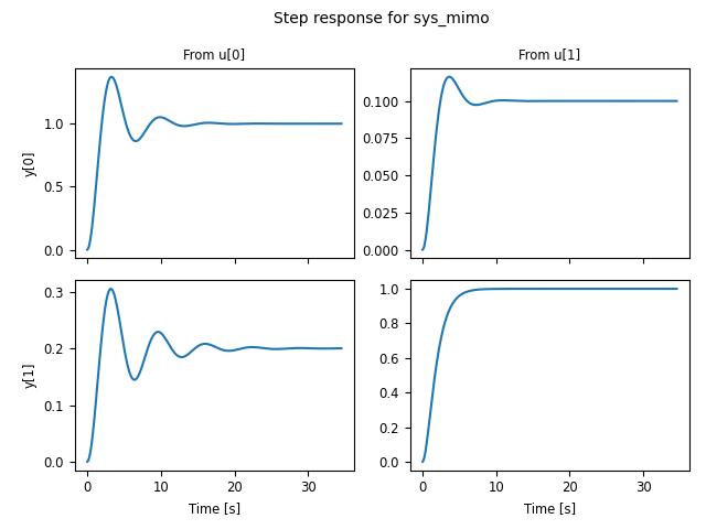
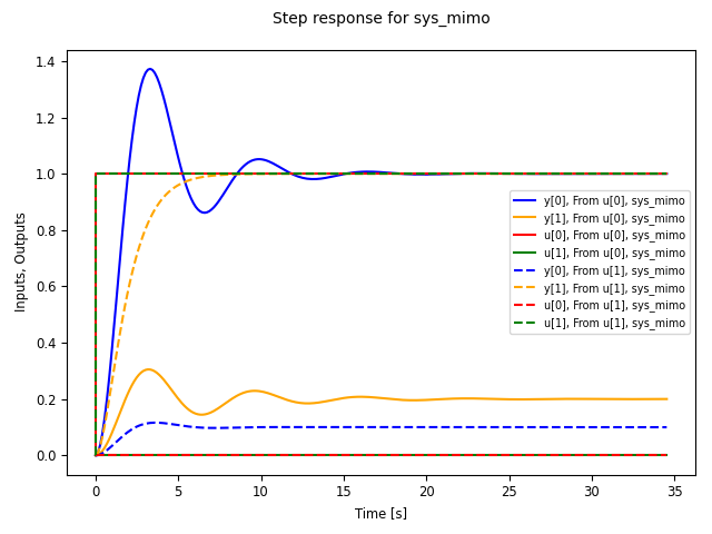
for a two-input, two-output can be plotted using the commands:
sys_mimo = ct.tf2ss(
    [[[1], [0.1]], [[0.2], [1]]],
    [[[1, 0.6, 1], [1, 1, 1]], [[1, 0.4, 1], [1, 2, 1]]], name="sys_mimo")
response = ct.step_response(sys_mimo)
response.plot()
which produces the following plot:
A number of options are available in the time_response_plot()
function (and associated TimeResponseData.plot() method) to
customize the appearance of input output data. For data produced by
the impulse_response() and step_response() commands, the
inputs are not shown. This behavior can be changed using the
plot_inputs keyword. It is also possible to combine multiple lines
onto a single graph, using either the overlay_signals keyword (which
puts all outputs out a single graph and all inputs on a single graph)
or the overlay_traces keyword, which puts different traces (e.g.,
corresponding to step inputs in different channels) on the same graph,
with appropriate labeling via a legend on selected axes.
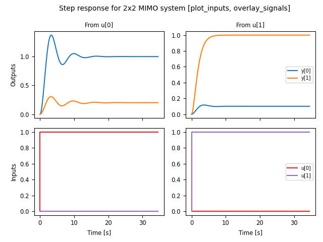
For example, using plot_input = True and overlay_signals = True
yields the following plot:
ct.step_response(sys_mimo).plot(
  plot_inputs=True, overlay_signals=True,
  title="Step response for 2x2 MIMO system " +
  "[plot_inputs, overlay_signals]")
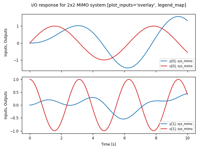
Input/output response plots created with either the
forced_response() or the
input_output_response() functions include the input signals by
default. These can be plotted on separate axes, but also “overlaid” on the
output axes (useful when the input and output signals are being compared to
each other). The following plot shows the use of plot_inputs = ‘overlay’
as well as the ability to reposition the legends using the legend_map
keyword:
timepts = np.linspace(0, 10, 100)
U = np.vstack([np.sin(timepts), np.cos(2*timepts)])
ct.input_output_response(sys_mimo, timepts, U).plot(
    plot_inputs='overlay',
    legend_map=np.array([['lower right'], ['lower right']]),
    title="I/O response for 2x2 MIMO system " +
    "[plot_inputs='overlay', legend_map]")
Another option that is available is to use the transpose keyword so that
instead of plotting the outputs on the top and inputs on the bottom, the
inputs are plotted on the left and outputs on the right, as shown in the
following figure:
U1 = np.vstack([np.sin(timepts), np.cos(2*timepts)])
resp1 = ct.input_output_response(sys_mimo, timepts, U1)

U2 = np.vstack([np.cos(2*timepts), np.sin(timepts)])
resp2 = ct.input_output_response(sys_mimo, timepts, U2)

ct.combine_time_responses(
    [resp1, resp2], trace_labels=["Scenario #1", "Scenario #2"]).plot(
        transpose=True,
        title="I/O responses for 2x2 MIMO system, multiple traces "
        "[transpose]")
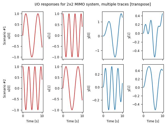
This figure also illustrates the ability to create “multi-trace” plots
using the combine_time_responses() function. The line
properties that are used when combining signals and traces are set by
the input_props, output_props and trace_props parameters for
time_response_plot().
Additional customization is possible using the input_props,
output_props, and trace_props keywords to set complementary line colors
and styles for various signals and traces:
cplt = ct.step_response(sys_mimo).plot(
    plot_inputs='overlay', overlay_signals=True, overlay_traces=True,
    output_props=[{'color': c} for c in ['blue', 'orange']],
    input_props=[{'color': c} for c in ['red', 'green']],
    trace_props=[{'linestyle': s} for s in ['-', '--']])
4.2. Frequency Response Data
Linear time invariant (LTI) systems can be analyzed in terms of their
frequency response and python-control provides a variety of tools for
carrying out frequency response analysis. The most basic of these is
the frequency_response() function, which will compute
the frequency response for one or more linear systems:
sys1 = ct.tf([1], [1, 2, 1], name='sys1')
sys2 = ct.tf([1, 0.2], [1, 1, 3, 1, 1], name='sys2')
response = ct.frequency_response([sys1, sys2])
A Bode plot provide a graphical view of the response an LTI system and can
be generated using the bode_plot() function:
ct.bode_plot(response, initial_phase=0)
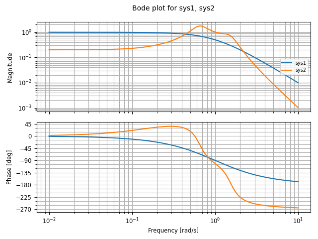
Computing the response for multiple systems at the same time yields a common frequency range that covers the features of all listed systems.
Bode plots can also be created directly using the
FrequencyResponseData.plot() method:
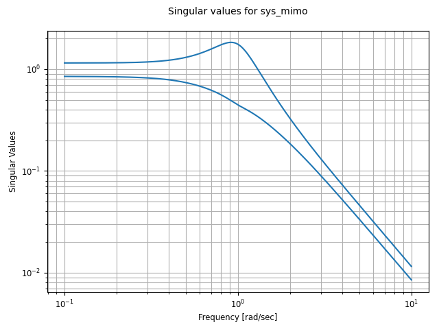
sys_mimo = ct.tf(
    [[[1], [0.1]], [[0.2], [1]]],
    [[[1, 0.6, 1], [1, 1, 1]], [[1, 0.4, 1], [1, 2, 1]]], name="sys_mimo")
ct.frequency_response(sys_mimo).plot()
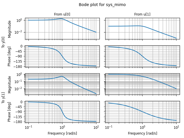
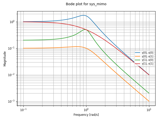
A variety of options are available for customizing Bode plots, for example allowing the display of the phase to be turned off or overlaying the inputs or outputs:
ct.frequency_response(sys_mimo).plot(
    plot_phase=False, overlay_inputs=True, overlay_outputs=True)
The singular_values_response() function can be used to
generate Bode plots that show the singular values of a transfer
function:
ct.singular_values_response(sys_mimo).plot()
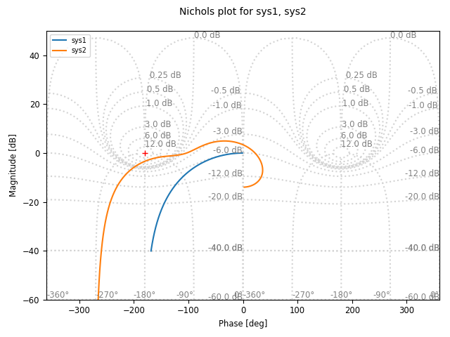
Different types of plots can also be specified for a given frequency
response. For example, to plot the frequency response using a a Nichols
plot, use plot_type = ‘nichols’:
response.plot(plot_type='nichols')
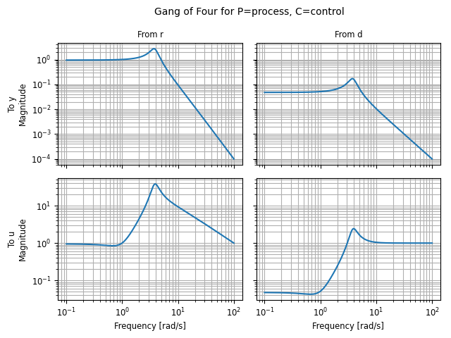
Another response function that can be used to generate Bode plots is the
gangof4_response() function, which computes the four primary
sensitivity functions for a feedback control system in standard form:
proc = ct.tf([1], [1, 1, 1], name="process")
ctrl = ct.tf([100], [1, 5], name="control")
response = ct.gangof4_response(proc, ctrl)
ct.bode_plot(response)        # or response.plot()
Nyquist analysis can be done using the nyquist_response()
function, which evaluates an LTI system along the Nyquist contour, and
the nyquist_plot() function, which generates a Nyquist plot:
sys = ct.tf([1, 0.2], [1, 1, 3, 1, 1], name='sys')
ct.nyquist_plot(sys)

The nyquist_response() function can be used to compute
the number of encirclements of the -1 point and can return the Nyquist
contour that was used to generate the Nyquist curve.
By default, the Nyquist response will generate small semicircles around
poles that are on the imaginary axis. In addition, portions of the Nyquist
curve that are far from the origin are scaled to a maximum value, while the
line style is changed to reflect the scaling, and it is possible to offset
the scaled portions to separate out the portions of the Nyquist curve at
 . A number of keyword parameters for both are available for
nyquist_response() and nyquist_plot() to tune
the computation of the Nyquist curve and the way the data are plotted:
sys = ct.tf([1, 0.2], [1, 0, 1]) * ct.tf([1], [1, 0])
nyqresp = ct.nyquist_response(sys)
nyqresp.plot(
    max_curve_magnitude=6, max_curve_offset=1, blend_fraction=0.05,
    arrows=[0, 0.15, 0.3, 0.6, 0.7, 0.925],
    title='Custom Nyquist plot')
print("Encirclements =", nyqresp.count)

All frequency domain plotting functions will automatically compute the range of frequencies to plot based on the poles and zeros of the frequency response. Frequency points can be explicitly specified by including an array of frequencies as a second argument (after the list of systems):
sys1 = ct.tf([1], [1, 2, 1], name='sys1')
sys2 = ct.tf([1, 0.2], [1, 1, 3, 1, 1], name='sys2')
omega = np.logspace(-2, 2, 500)
ct.frequency_response([sys1, sys2], omega).plot(initial_phase=0)

Alternatively, frequency ranges can be specified by passing a list of the
form [wmin, wmax], where wmin and wmax are the minimum and
maximum frequencies in the (log-spaced) frequency range:
response = ct.frequency_response([sys1, sys2], [1e-2, 1e2])
The number of (log-spaced) points in the frequency can be specified using
the omega_num keyword parameter.
Frequency response data can also be accessed directly and plotted manually:
sys = ct.rss(4, 2, 2, strictly_proper=True)  # 2x2 MIMO system
fresp = ct.frequency_response(sys)
plt.loglog(fresp.omega, fresp.magnitude['y[1]', 'u[0]'])
Access to frequency response data is available via the attributes
omega, magnitude, phase, and response, where response
represents the complex value of the frequency response at each frequency.
The magnitude, phase, and response arrays can be indexed using
either input/output indices or signal names, with the first index
corresponding to the output signal and the second input corresponding to
the input signal.
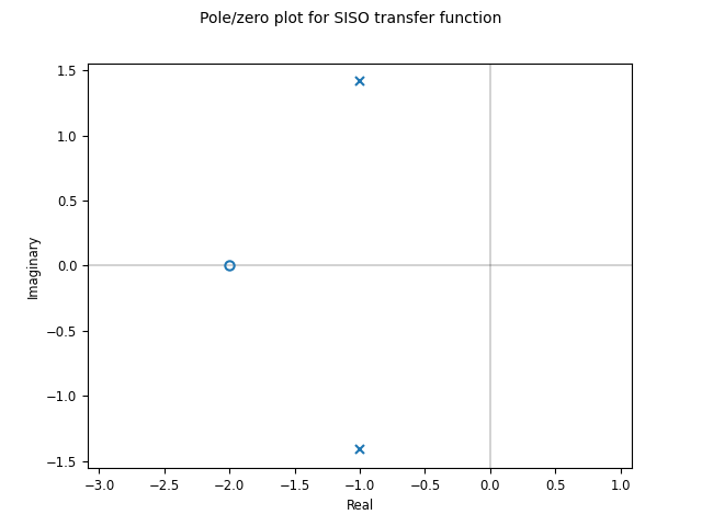
4.3. Pole/Zero Data
Pole/zero maps and root locus diagrams provide insights into system
response based on the locations of system poles and zeros in the complex
plane. The pole_zero_map() function returns the poles and
zeros and can be used to generate a pole/zero plot:
sys = ct.tf([1, 2], [1, 2, 3], name='SISO transfer function')
response = ct.pole_zero_map(sys)
ct.pole_zero_plot(response)
A root locus plot shows the location of the closed loop poles of a system as a function of the loop gain:
ct.root_locus_map(sys).plot()
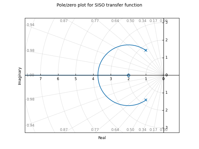
The grid in the left hand plane shows lines of constant damping ratio as
well as arcs corresponding to the frequency of the complex pole. The grid
can be turned off using the grid keyword. Setting grid to False will
turn off the grid but show the real and imaginary axis. To completely
remove all lines except the root loci, use grid = ‘empty’.
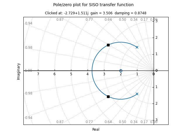
On systems that support interactive plots, clicking on a location on the root locus diagram will mark the pole locations on all branches of the diagram and display the gain and damping ratio for the clicked point below the plot title:
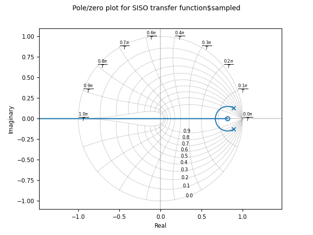
Root locus diagrams are also supported for discrete-time systems, in which case the grid is show inside the unit circle:
sysd = sys.sample(0.1)
ct.root_locus_plot(sysd)
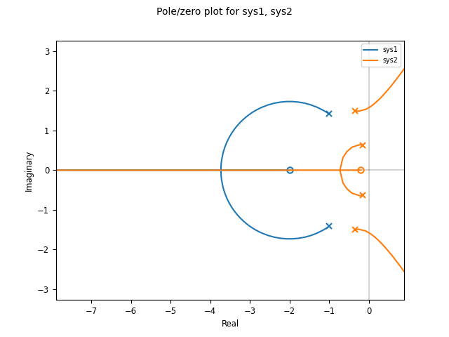
Lists of systems can also be given, in which case the root locus diagram for each system is plotted in different colors:
sys1 = ct.tf([1], [1, 2, 1], name='sys1')
sys2 = ct.tf([1, 0.2], [1, 1, 3, 1, 1], name='sys2')
ct.root_locus_plot([sys1, sys2], grid=False)
4.4. Customizing Control Plots
A set of common options are available to customize control plots in various ways. The following general rules apply:
If a plotting function is called multiple times with data that generate control plots with the same shape for the array of subplots, the new data will be overlaid with the old data, with a change in color(s) for the new data (chosen from the standard matplotlib color cycle). If not overridden, the plot title and legends will be updated to reflect all data shown on the plot.
If a plotting function is called and the shape for the array of subplots does not match the currently displayed plot, a new figure is created. Note that only the shape is checked, so if two different types of plotting commands that generate the same shape of subplots are called sequentially, the
matplotlib.pyplot.figure()command should be used to explicitly create a new figure.The
axkeyword argument can be used to direct the plotting function to use a specific axes or array of axes. The value of theaxkeyword must have the proper number of axes for the plot (so a plot generating a 2x2 array of subplots should be given a 2x2 array of axes for theaxkeyword).The
color,linestyle,linewidth, and other matplotlib line property arguments can be used to override the default line properties. If these arguments are absent, the default matplotlib line properties are used and the color cycles through the default matplotlib color cycle.The
bode_plot(),time_response_plot(), and selected other commands can also accept a matplotlib format string (e.g., ‘r–‘). The format string must appear as a positional argument right after the required data argument.Note that line property arguments are the same for all lines generated as part of a single plotting command call, including when multiple responses are passed as a list to the plotting command. For this reason it is often easiest to call multiple plot commands in sequence, with each command setting the line properties for that system/trace.
The
labelkeyword argument can be used to override the line labels that are used in generating the title and legend. If more than one line is being plotted in a given call to a plot command, thelabelargument value should be a list of labels, one for each line, in the order they will appear in the legend.For input/output plots (frequency and time responses), the labels that appear in the legend are of the form “<output name>, <input name>, <trace name>, <system name>”. The trace name is used only for multi-trace time plots (for example, step responses for MIMO systems). Common information present in all traces is removed, so that the labels appearing in the legend represent the unique characteristics of each line.
For non-input/output plots (e.g., Nyquist plots, pole/zero plots, root locus plots), the default labels are the system name.
If
labelis set to False, individual lines are still given labels, but no legend is generated in the plot. (This can also be accomplished by settinglegend_mapto False).Note: the
labelkeyword argument is not implemented for describing function plots or phase plane plots, since these plots are primarily intended to be for a single system. Standardmatplotlibcommands can be used to customize these plots for displaying information for multiple systems.The
legend_loc,legend_mapandshow_legendkeyword arguments can be used to customize the locations for legends. By default, a minimal number of legends are used such that lines can be uniquely identified and no legend is generated if there is only one line in the plot. Settingshow_legendto False will suppress the legend and setting it to True will force the legend to be displayed even if there is only a single line in each axes. In addition, if the value of thelegend_lockeyword argument is set to a string or integer, it will set the position of the legend as described in thematplotlib.legend()documentation. Finally,legend_mapcan be set to an array that matches the shape of the subplots, with each item being a string indicating the location of the legend for that axes (or None for no legend).The
rcParamskeyword argument can be used to override the default matplotlib style parameters used when creating a plot. The default parameters for all control plots are given by theconfig.defaults['ctrlplot.rcParams']dictionary and have the following values:Key
Value
‘axes.labelsize’
‘small’
‘axes.titlesize’
‘small’
‘figure.titlesize’
‘medium’
‘legend.fontsize’
‘x-small’
‘xtick.labelsize’
‘small’
‘ytick.labelsize’
‘small’
Only those values that should be changed from the default need to be specified in the
rcParamskeyword argument. To override the defaults for all control plots, update theconfig.defaults['ctrlplt.rcParams']dictionary entries. For convenience, this dictionary can also be accessed asct.rcParams.The default values for style parameters for control plots can be restored using
reset_rcParams().For multi-input, multi-output time and frequency domain plots, the
sharexandshareykeyword arguments can be used to determine whether and how axis limits are shared between the individual subplots. Setting the keyword to ‘row’ will share the axes limits across all subplots in a row, ‘col’ will share across all subplots in a column, ‘all’ will share across all subplots in the figure, and False will allow independent limits for each subplot.For Bode plots, the
share_magnitudeandshare_phasekeyword arguments can be used to independently control axis limit sharing for the magnitude and phase portions of the plot, andshare_frequencycan be used instead ofsharex.The
titlekeyword can be used to override the automatic creation of the plot title. The default title is a string of the form “<Type> plot for <syslist>” where <syslist> is a list of the sys names contained in the plot (which is updated if the plotting function is called multiple times). Usetitle= False to suppress the title completely. The title can also be updated using theset_plot_title()method for the returned control plot object.The plot title is only generated if
axis None.
The following code illustrates the use of some of these customization features:
P = ct.tf([0.02], [1, 0.1, 0.01])   # servomechanism
C1 = ct.tf([1, 1], [1, 0])          # unstable
L1 = P * C1
C2 = ct.tf([1, 0.05], [1, 0])       # stable
L2 = P * C2

plt.rcParams.update(ct.rcParams)
fig = plt.figure(figsize=[7, 4])
ax_mag = fig.add_subplot(2, 2, 1)
ax_phase = fig.add_subplot(2, 2, 3)
ax_nyquist = fig.add_subplot(1, 2, 2)

ct.bode_plot(
    [L1, L2], ax=[ax_mag, ax_phase],
    label=["$L_1$ (unstable)", "$L_2$ (unstable)"],
    show_legend=False)
ax_mag.set_title("Bode plot for $L_1$, $L_2$")
ax_mag.tick_params(labelbottom=False)
fig.align_labels()

ct.nyquist_plot(L1, ax=ax_nyquist, label="$L_1$ (unstable)")
ct.nyquist_plot(
    L2, ax=ax_nyquist, label="$L_2$ (stable)",
    max_curve_magnitude=22, legend_loc='upper right')
ax_nyquist.set_title("Nyquist plot for $L_1$, $L_2$")

fig.suptitle("Loop analysis for servomechanism control design")
plt.tight_layout()

As this example illustrates, python-control plotting functions and
Matplotlib plotting functions can generally be intermixed. One type of
plot for which this does not currently work is pole/zero plots with a
continuous-time omega-damping grid (including root locus diagrams), due to
the way that axes grids are implemented. As a workaround, the
pole_zero_subplots() command can be used to create an array
of subplots with different grid types, as illustrated in the following
example:
ax_array = ct.pole_zero_subplots(2, 1, grid=[True, False])
sys1 = ct.tf([1, 2], [1, 2, 3], name='sys1')
sys2 = ct.tf([1, 0.2], [1, 1, 3, 1, 1], name='sys2')
ct.root_locus_plot([sys1, sys2], ax=ax_array[0, 0])
cplt = ct.root_locus_plot([sys1, sys2], ax=ax_array[1, 0])
cplt.set_plot_title("Root locus plots (w/ specified axes)")
cplt.figure.tight_layout()

Alternatively, turning off the omega-damping grid (using grid = False or
grid = ‘empty’) allows use of Matplotlib layout commands.
4.5. Response and Plotting Reference
Response functions
Response functions take a system or list of systems and return a response
object that can be used to retrieve information about the system (e.g., the
number of encirclements for a Nyquist plot) as well as plotting (via the
plot method).
|
Compute the describing function response of a system. |
|
Frequency response of an LTI system. |
|
Compute the output of a linear system given the input. |
|
Compute response of "Gang of 4" transfer functions. |
|
Compute the impulse response for a linear system. |
|
Compute the initial condition response for a linear system. |
|
Compute the output response of a system to a given input. |
|
Nyquist response for a system. |
|
Compute the pole/zero map for an LTI system. |
|
Compute the root locus map for an LTI system. |
|
Singular value response for a system. |
|
Compute the step response for a linear system. |
Plotting functions
Plotting functions take a response or list of responses and return a
ControlPlot object that can be used to retrieve information about
the plot. Plotting functions can also be called with a system or list
of systems, in which case the appropriate response will be first
computed and then plotted.
Note that the phase_plane_plot function is part of the
python-control namespace, but the individual functions for customizing
phase plots are contained in the phaseplot module, which should be
imported separately using import control.phaseplot as pp. The
phase plane plotting functionality is described in more detail in the
Phase Plane Plots section.
|
Bode plot for a system. |
|
Nyquist plot with describing function for a nonlinear system. |
|
Nichols plot for a system. |
|
Nyquist plot for a system. |
|
Plot phase plane diagram. |
|
Generate list of points around a circle. |
|
Plot equilibrium points in the phase plane. |
|
Generate list of points forming a mesh. |
|
Plot separatrices in the phase plane. |
|
Plot stream lines in the phase plane. |
|
Plot a vector field in the phase plane. |
|
Plot a pole/zero map for a linear system. |
|
Root locus plot. |
|
Plot the singular values for a system. |
|
Plot the time response of an input/output system. |
Utility functions
These additional functions can be used to manipulate response data or carry out other operations in creating control plots.
|
Generate list of points along the edge of box. |
|
Combine individual time responses into multi-trace response. |
|
Create axes for pole/zero plot. |
Reset rcParams to default values for control plots. |
Response and plotting classes
The following classes are used in generating response data.
|
Return class for control platting functions. |
|
Results of describing function analysis. |
|
Input/output model defined by frequency response data (FRD). |
|
List of FrequencyResponseData objects with plotting capability. |
|
Nyquist response data object. |
|
Pole/zero data object. |
|
Input/output system time response data. |
|
List of TimeResponseData objects with plotting capability. |