Plotting data
The Python Control Systems Toolbox contains a number of functions for plotting input/output responses in the time and frequency domain, root locus diagrams, and other standard charts used in control system analysis, for example:
bode_plot(sys)
nyquist_plot([sys1, sys2])
phase_plane_plot(sys, limits)
pole_zero_plot(sys)
root_locus_plot(sys)
While plotting functions can be called directly, the standard pattern used in the toolbox is to provide a function that performs the basic computation or analysis (e.g., computation of the time or frequency response) and returns and object representing the output data. A separate plotting function, typically ending in _plot is then used to plot the data, resulting in the following standard pattern:
response = ct.nyquist_response([sys1, sys2])
count = ct.response.count          # number of encirclements of -1
lines = ct.nyquist_plot(response)  # Nyquist plot
The returned value lines provides access to the individual lines in the generated plot, allowing various aspects of the plot to be modified to suit specific needs.
The plotting function is also available via the plot() method of the analysis object, allowing the following type of calls:
step_response(sys).plot()
frequency_response(sys).plot()
nyquist_response(sys).plot()
pp.streamlines(sys, limits).plot()
root_locus_map(sys).plot()
The remainder of this chapter provides additional documentation on how these response and plotting functions can be customized.
Time response data
Input/output time responses are produced one of several python-control
functions: forced_response(),
impulse_response(), initial_response(),
input_output_response(), step_response().
Each of these return a TimeResponseData object, which
contains the time, input, state, and output vectors associated with the
simulation. Time response data can be plotted with the
time_response_plot() function, which is also available as
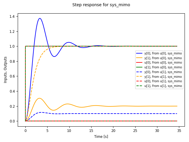
the plot() method. For example, the step
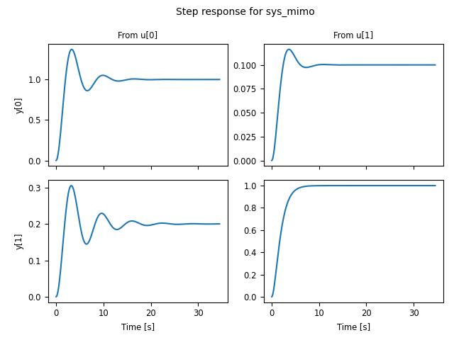
response for a two-input, two-output can be plotted using the commands:
sys_mimo = ct.tf2ss(
    [[[1], [0.1]], [[0.2], [1]]],
    [[[1, 0.6, 1], [1, 1, 1]], [[1, 0.4, 1], [1, 2, 1]]], name="sys_mimo")
response = ct.step_response(sys)
response.plot()
which produces the following plot:
The TimeResponseData object can also be used to access
the data from the simulation:
time, outputs, inputs = response.time, response.outputs, response.inputs
fig, axs = plt.subplots(2, 2)
for i in range(2):
    for j in range(2):
        axs[i, j].plot(time, outputs[i, j])
A number of options are available in the plot method to customize
the appearance of input output data. For data produced by the
impulse_response() and step_response()
commands, the inputs are not shown. This behavior can be changed
using the plot_inputs keyword. It is also possible to combine
multiple lines onto a single graph, using either the overlay_signals
keyword (which puts all outputs out a single graph and all inputs on a
single graph) or the overlay_traces keyword, which puts different
traces (e.g., corresponding to step inputs in different channels) on
the same graph, with appropriate labeling via a legend on selected
axes.
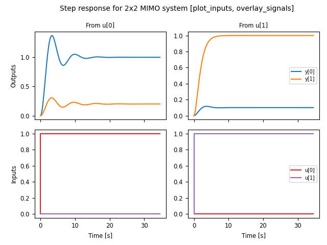
For example, using plot_input=True and overlay_signals=True yields the following plot:
ct.step_response(sys_mimo).plot(
  plot_inputs=True, overlay_signals=True,
  title="Step response for 2x2 MIMO system " +
  "[plot_inputs, overlay_signals]")
Input/output response plots created with either the
forced_response() or the
input_output_response() functions include the input signals by
default. These can be plotted on separate axes, but also “overlaid” on the
output axes (useful when the input and output signals are being compared to
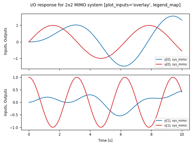
each other). The following plot shows the use of plot_inputs=’overlay’
as well as the ability to reposition the legends using the legend_map
keyword:
timepts = np.linspace(0, 10, 100)
U = np.vstack([np.sin(timepts), np.cos(2*timepts)])
ct.input_output_response(sys_mimo, timepts, U).plot(
    plot_inputs='overlay',
    legend_map=np.array([['lower right'], ['lower right']]),
    title="I/O response for 2x2 MIMO system " +
    "[plot_inputs='overlay', legend_map]")
Another option that is available is to use the transpose keyword so that instead of plotting the outputs on the top and inputs on the bottom, the inputs are plotted on the left and outputs on the right, as shown in the following figure:
U1 = np.vstack([np.sin(timepts), np.cos(2*timepts)])
resp1 = ct.input_output_response(sys_mimo, timepts, U1)

U2 = np.vstack([np.cos(2*timepts), np.sin(timepts)])
resp2 = ct.input_output_response(sys_mimo, timepts, U2)

ct.combine_time_responses(
    [resp1, resp2], trace_labels=["Scenario #1", "Scenario #2"]).plot(
        transpose=True,
        title="I/O responses for 2x2 MIMO system, multiple traces "
        "[transpose]")
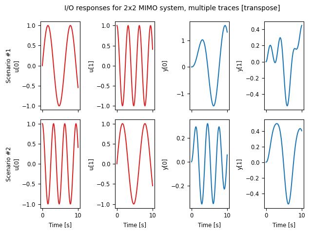
This figure also illustrates the ability to create “multi-trace” plots
using the combine_time_responses() function. The line
properties that are used when combining signals and traces are set by
the input_props, output_props and trace_props parameters for
time_response_plot().
Additional customization is possible using the input_props, output_props, and trace_props keywords to set complementary line colors and styles for various signals and traces:
out = ct.step_response(sys_mimo).plot(
    plot_inputs='overlay', overlay_signals=True, overlay_traces=True,
    output_props=[{'color': c} for c in ['blue', 'orange']],
    input_props=[{'color': c} for c in ['red', 'green']],
    trace_props=[{'linestyle': s} for s in ['-', '--']])
Frequency response data
Linear time invariant (LTI) systems can be analyzed in terms of their
frequency response and python-control provides a variety of tools for
carrying out frequency response analysis. The most basic of these is
the frequency_response() function, which will compute
the frequency response for one or more linear systems:
sys1 = ct.tf([1], [1, 2, 1], name='sys1')
sys2 = ct.tf([1, 0.2], [1, 1, 3, 1, 1], name='sys2')
response = ct.frequency_response([sys1, sys2])
A Bode plot provide a graphical view of the response an LTI system and can
be generated using the bode_plot() function:
ct.bode_plot(response, initial_phase=0)
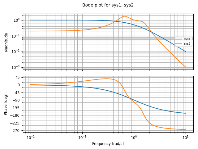
Computing the response for multiple systems at the same time yields a common frequency range that covers the features of all listed systems.
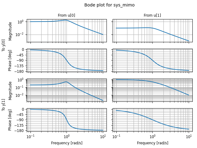
Bode plots can also be created directly using the
plot() method:
sys_mimo = ct.tf(
    [[[1], [0.1]], [[0.2], [1]]],
    [[[1, 0.6, 1], [1, 1, 1]], [[1, 0.4, 1], [1, 2, 1]]], name="sys_mimo")
ct.frequency_response(sys_mimo).plot()
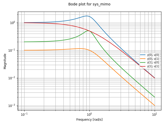
A variety of options are available for customizing Bode plots, for example allowing the display of the phase to be turned off or overlaying the inputs or outputs:
ct.frequency_response(sys_mimo).plot(
    plot_phase=False, overlay_inputs=True, overlay_outputs=True)
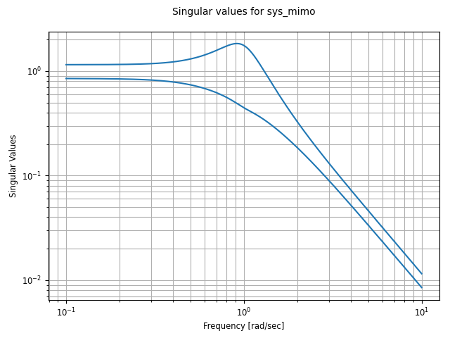
The singular_values_response() function can be used to
generate Bode plots that show the singular values of a transfer
function:
ct.singular_values_response(sys_mimo).plot()
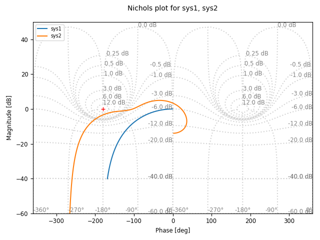
Different types of plots can also be specified for a given frequency response. For example, to plot the frequency response using a a Nichols plot, use plot_type=’nichols’:
response.plot(plot_type='nichols')
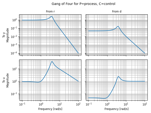
Another response function that can be used to generate Bode plots is
the gangof4() function, which computes the four primary
sensitivity functions for a feedback control system in standard form:
proc = ct.tf([1], [1, 1, 1], name="process")
ctrl = ct.tf([100], [1, 5], name="control")
response = rect.gangof4_response(proc, ctrl)
ct.bode_plot(response)      # or response.plot()
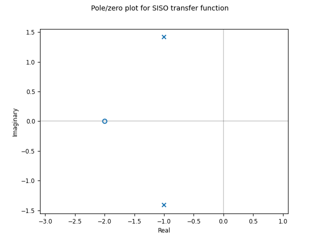
Pole/zero data
Pole/zero maps and root locus diagrams provide insights into system
response based on the locations of system poles and zeros in the complex
plane. The pole_zero_map() function returns the poles and
zeros and can be used to generate a pole/zero plot:
sys = ct.tf([1, 2], [1, 2, 3], name='SISO transfer function')
response = ct.pole_zero_map(sys)
ct.pole_zero_plot(response)
A root locus plot shows the location of the closed loop poles of a system as a function of the loop gain:
ct.root_locus_map(sys).plot()
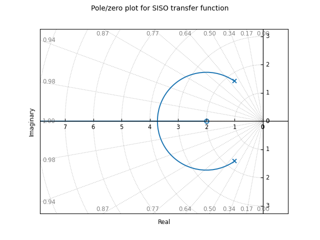
The grid in the left hand plane shows lines of constant damping ratio as well as arcs corresponding to the frequency of the complex pole. The grid can be turned off using the grid keyword. Setting grid to False will turn off the grid but show the real and imaginary axis. To completely remove all lines except the root loci, use grid=’empty’.
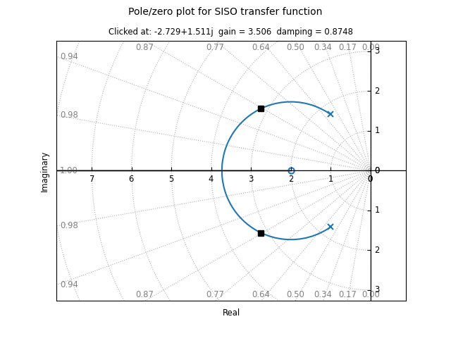
On systems that support interactive plots, clicking on a location on the root locus diagram will mark the pole locations on all branches of the diagram and display the gain and damping ratio for the clicked point below the plot title:
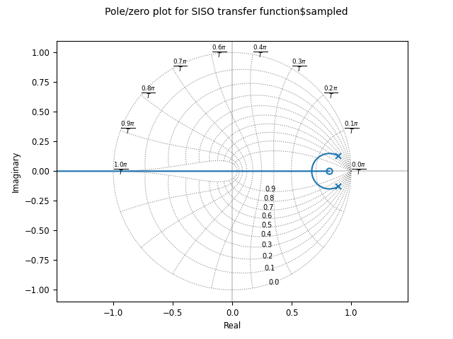
Root locus diagrams are also supported for discrete time systems, in which case the grid is show inside the unit circle:
sysd = sys.sample(0.1)
ct.root_locus_plot(sysd)
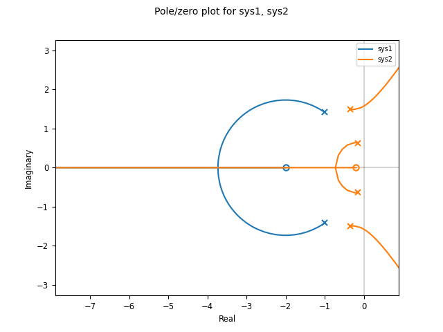
Lists of systems can also be given, in which case the root locus diagram for each system is plotted in different colors:
sys1 = ct.tf([1], [1, 2, 1], name='sys1')
sys2 = ct.tf([1, 0.2], [1, 1, 3, 1, 1], name='sys2')
ct.root_locus_plot([sys1, sys2], grid=False)
Phase plane plots
Insight into nonlinear systems can often be obtained by looking at phase
plane diagrams. The phase_plane_plot() function allows the
creation of a 2-dimensional phase plane diagram for a system. This
functionality is supported by a set of mapping functions that are part of
the phaseplot module.
The default method for generating a phase plane plot is to provide a 2D dynamical system along with a range of coordinates and time limit:
sys = ct.nlsys(
    lambda t, x, u, params: np.array([[0, 1], [-1, -1]]) @ x,
    states=['position', 'velocity'], inputs=0, name='damped oscillator')
axis_limits = [-1, 1, -1, 1]
T = 8
ct.phase_plane_plot(sys, axis_limits, T)
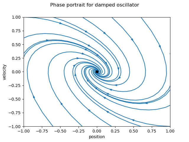
By default, the plot includes streamlines generated from starting points on limits of the plot, with arrows showing the flow of the system, as well as any equilibrium points for the system. A variety of options are available to modify the information that is plotted, including plotting a grid of vectors instead of streamlines and turning on and off various features of the plot.
To illustrate some of these possibilities, consider a phase plane plot for an inverted pendulum system, which is created using a mesh grid:
def invpend_update(t, x, u, params):
    m, l, b, g = params['m'], params['l'], params['b'], params['g']
    return [x[1], -b/m * x[1] + (g * l / m) * np.sin(x[0]) + u[0]/m]
invpend = ct.nlsys(invpend_update, states=2, inputs=1, name='invpend')

ct.phase_plane_plot(
    invpend, [-2*pi, 2*pi, -2, 2], 5,
    gridtype='meshgrid', gridspec=[5, 8], arrows=3,
    plot_equilpoints={'gridspec': [12, 9]},
    params={'m': 1, 'l': 1, 'b': 0.2, 'g': 1})
plt.xlabel(r"$\theta$ [rad]")
plt.ylabel(r"$\dot\theta$ [rad/sec]")
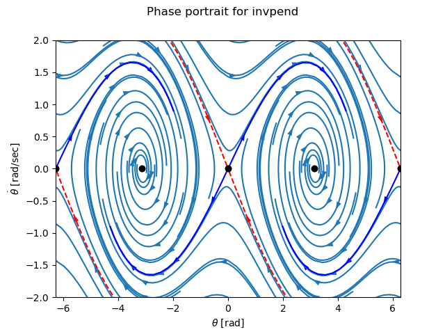
This figure shows several features of more complex phase plane plots: multiple equilibrium points are shown, with saddle points showing separatrices, and streamlines generated along a 5x8 mesh of initial conditions. At each mesh point, a streamline is created that goes 5 time units forward and backward in time. A separate grid specification is used to find equilibrium points and separatrices (since the course grid spacing of 5x8 does not find all possible equilibrium points). Together, the multiple features in the phase plane plot give a good global picture of the topological structure of solutions of the dynamical system.
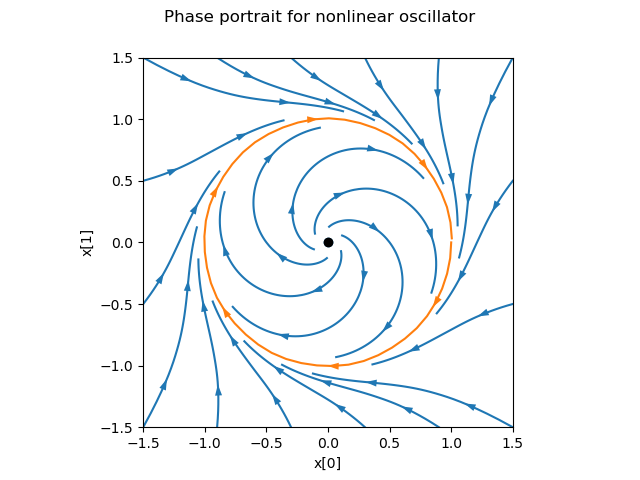
Phase plots can be built up by hand using a variety of helper functions that
are part of the phaseplot (pp) module:
import control.phaseplot as pp

def oscillator_update(t, x, u, params):
    return [x[1] + x[0] * (1 - x[0]**2 - x[1]**2),
            -x[0] + x[1] * (1 - x[0]**2 - x[1]**2)]
oscillator = ct.nlsys(
    oscillator_update, states=2, inputs=0, name='nonlinear oscillator')

ct.phase_plane_plot(oscillator, [-1.5, 1.5, -1.5, 1.5], 0.9)
pp.streamlines(
    oscillator, np.array([[0, 0]]), 1.5,
    gridtype='circlegrid', gridspec=[0.5, 6], dir='both')
pp.streamlines(
    oscillator, np.array([[1, 0]]), 2*pi, arrows=6, color='b')
plt.gca().set_aspect('equal')
The following helper functions are available:
|
Plot equilibrium points in the phase plane. |
|
Plot separatrices in the phase plane. |
|
Plot stream lines in the phase plane. |
|
Plot a vector field in the phase plane. |
The phase_plane_plot() function calls these helper functions
based on the options it is passed.
Note that unlike other plotting functions, phase plane plots do not involve
computing a response and then plotting the result via a plot() method.
Instead, the plot is generated directly be a call to the
phase_plane_plot() function (or one of the
phaseplot helper functions.
Response and plotting functions
Response functions
Response functions take a system or list of systems and return a response object that can be used to retrieve information about the system (e.g., the number of encirclements for a Nyquist plot) as well as plotting (via the plot method).
|
Compute the describing function response of a system. |
|
Frequency response of an LTI system at multiple angular frequencies. |
|
Compute the output of a linear system given the input. |
|
Compute the response of the "Gang of 4" transfer functions for a system. |
|
Compute the impulse response for a linear system. |
|
Compute the initial condition response for a linear system. |
|
Compute the output response of a system to a given input. |
|
Nyquist response for a system. |
|
Compute the pole/zero map for an LTI system. |
|
Compute the root locus map for an LTI system. |
|
Singular value response for a system. |
|
Compute the step response for a linear system. |
Plotting functions
|
Bode plot for a system. |
|
Plot a Nyquist plot with a describing function for a nonlinear system. |
|
Nichols plot for a system. |
|
Plot phase plane diagram. |
|
Plot equilibrium points in the phase plane. |
|
Plot separatrices in the phase plane. |
|
Plot stream lines in the phase plane. |
|
Plot a vector field in the phase plane. |
|
Plot a pole/zero map for a linear system. |
|
Root locus plot. |
|
Plot the singular values for a system. |
|
Plot the time response of an input/output system. |
Utility functions
These additional functions can be used to manipulate response data or returned values from plotting routines.
|
Combine multiple individual time responses into a multi-trace response. |
|
Get a list of axes from an array of lines. |
Response classes
The following classes are used in generating response data.
|
Results of describing function analysis. |
|
A class for models defined by frequency response data (FRD). |
|
Nyquist response data object. |
|
Pole/zero data object. |
|
A class for returning time responses. |